
City
frames that work as hard as your copy
Urban rhythm, commercial clarity.
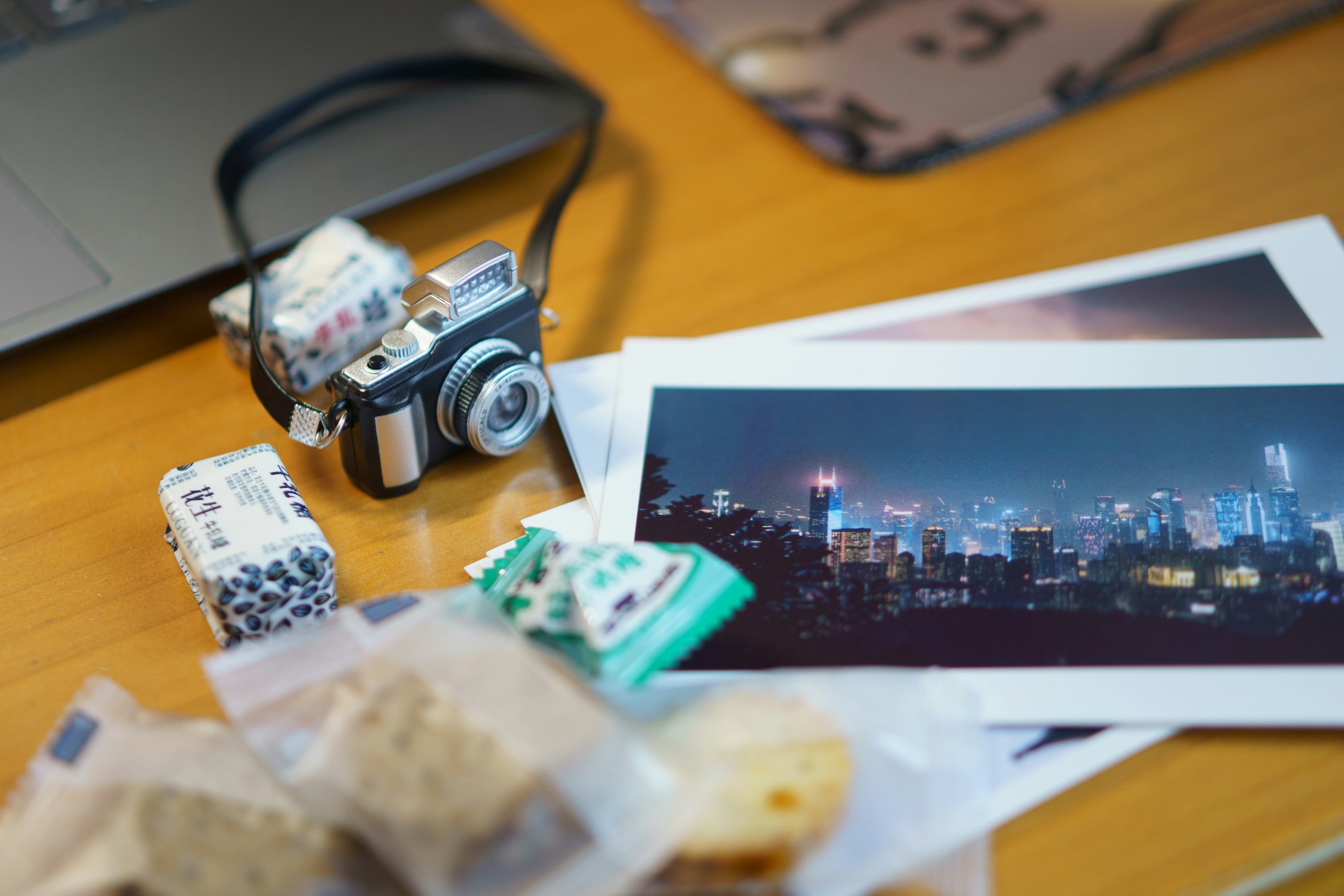
Everything here is digital: curated photo sets, layered files, texture plates, color tools, and practical learning resources focused on Commercial Photography, Art, and Graphics with an emphasis on urban, street-level imagery.
Your campaign, in city light.
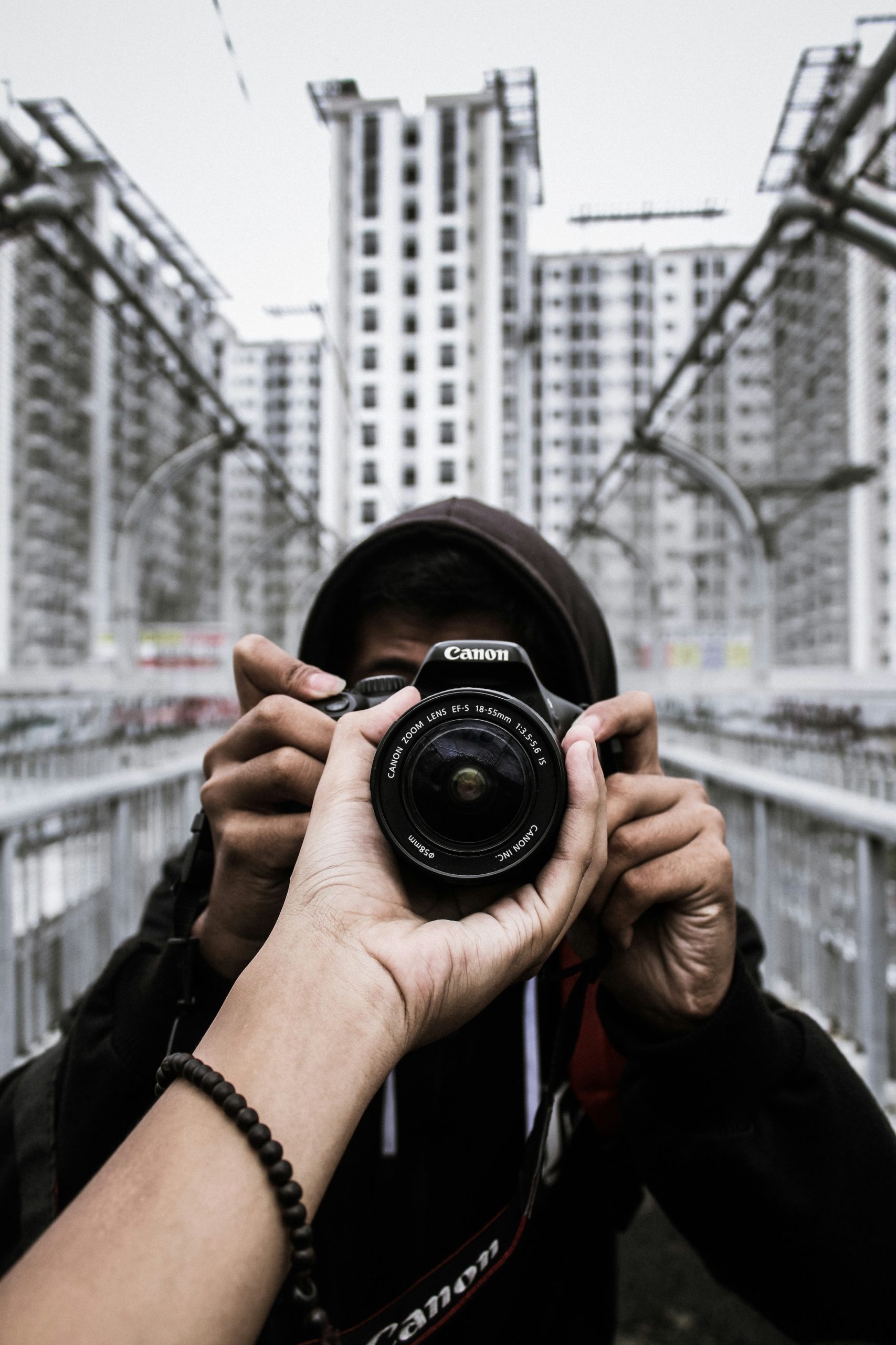
We’re a cross-disciplinary crew—photographers, retouchers, layout-minded editors, a rights coordinator, and two educators—working shoulder to shoulder on the streets we document. Field capture is planned like a production: scouting routes, logging light windows, and preparing release pathways when collaboration is involved. Back at the studio, files pass a tight pipeline—color-managed grading, caption verification, and metadata that actually helps teams search by mood, location, or time of day. We test deliverables across phones, laptops, and print proofs so the same image reads cleanly everywhere it appears. Our ethos is simple: respect people and place, keep the visuals honest, and deliver assets that reduce friction for designers, marketers, and editors. Continuous improvement is baked in—each collection incorporates feedback from real briefs, so the next set you download feels even more intuitive in your workflow.
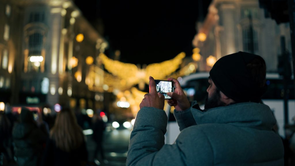
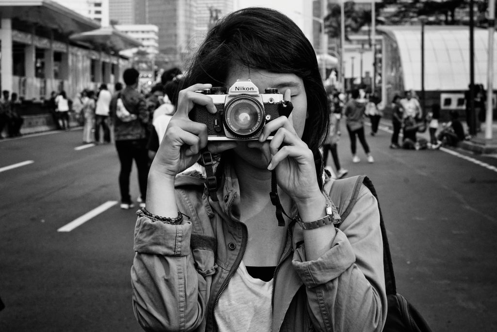
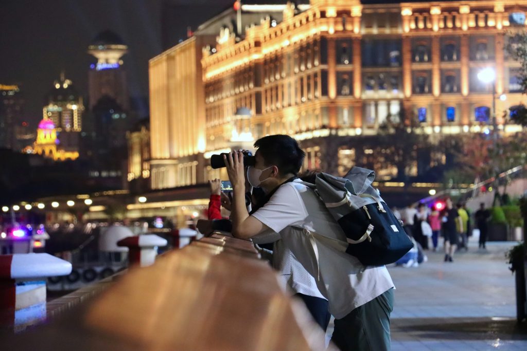
Real streets, real people, ready to publish
How We Maintain Quality
Images are reviewed on calibrated displays with soft proofing for web and print. We test reductions at phone sizes and expansions for posters. We check micro-blur, chromatic fringing, and compression resilience. If a scene involves staged collaboration, we maintain clear consent records and attach the right paperwork.
What We Do
Multiple file formats: 16-bit TIFF for master work, high-quality JPEG for rapid mocks, and DNG/RAW where relevant for advanced grading.
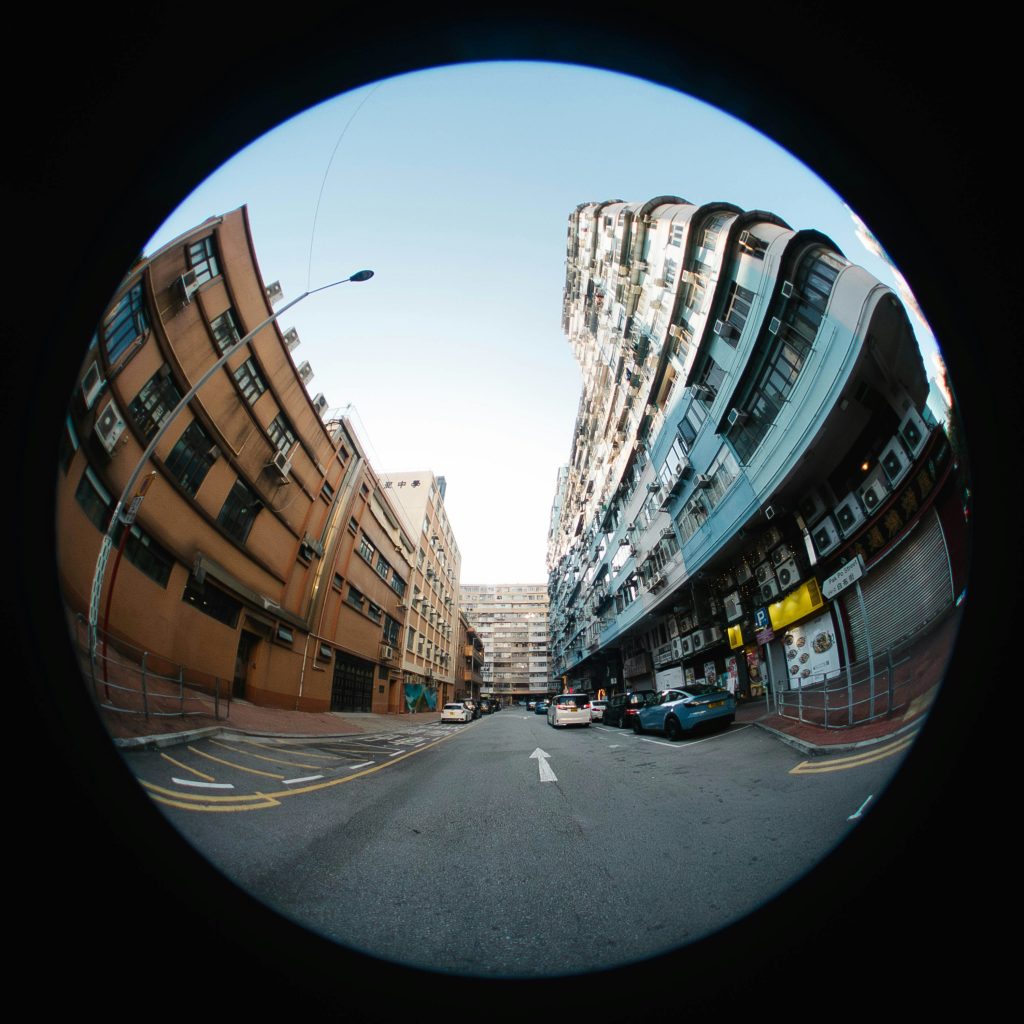
Versatile crops: Purposeful framing in 3:2, 4:5, 1:1, 16:9, and 9:16, so one set covers web banners, print spreads, carousels, reels, and digital signage.
Color-managed exports: sRGB for the web, Adobe RGB for print; neutral, human-friendly skin tones and controlled highlights for signage and glass.
Clear metadata: IPTC keywords, locations, and usage notes; consistent naming for instant search and smart collections.
Launch Microsite
Choose a set with HERO wide frames for the landing banner, calm mid-shots for product context, and detail textures for eye-level cutaways. Keep one grade across all pages; use the contact sheet to map images to sections before build.
Social Campaign
Lead with a 4:5 portrait anchored by a strong vertical line (doorway, pillar, crossing signal). Pair with 1:1 details and 9:16 motion-friendly backgrounds for story verticals. Maintain one central color accent across the series—bus red, poster yellow, or café blue.
Editorial Feature
Open with an establishing street corner at blue hour, follow with human-scale frames that show purpose—commute, market, conversation—and end with textures that can host pull quotes. Captions are already attached to the IPTC fields.
Geometry
for designers, life for the story
Support That Respects Your Deadlinevert.
Need a set that pairs fast pedestrian motion with copy-friendly negative space? Want a rain sequence with reflections but muted signage? Send the brief. You’ll get a short list of filenames, crop suggestions, and a note on release status—everything you need to decide quickly.
Bootcamp: Mobile Street Photography Workflow for Agencies
Course: Architectural Lines & Leading Compositions on Busy Streets
Seminar: Ethics, Permissions & Releases in Street Assignments
Download today
layout tonight.
Our Approach to Color and Tone
City light is complicated—sodium vapor, LEDs, shop fluorescents, screen glow. We aim for clean color relationships that won’t fight your brand palette. Skin reads human; whites are controlled; saturated signage doesn’t bleed into faces. In night suites, we retain enough contrast for legibility while protecting shadow detail for print.
Final Word
Urban photographs can either fight your layout or carry your message. These collections are designed to do the latter—city energy with commercial clarity. Use them to make pages breathe, carousels move, and stories feel lived in. When the deadline is close and the brief is specific, reach for images that already understand where they’re going: beside a headline, under a logo, across a screen, and into the world.